A selection of real websites designed and built by DanBaz Digital — a mix of client work, our own launched brands, and demo concepts across different industries.
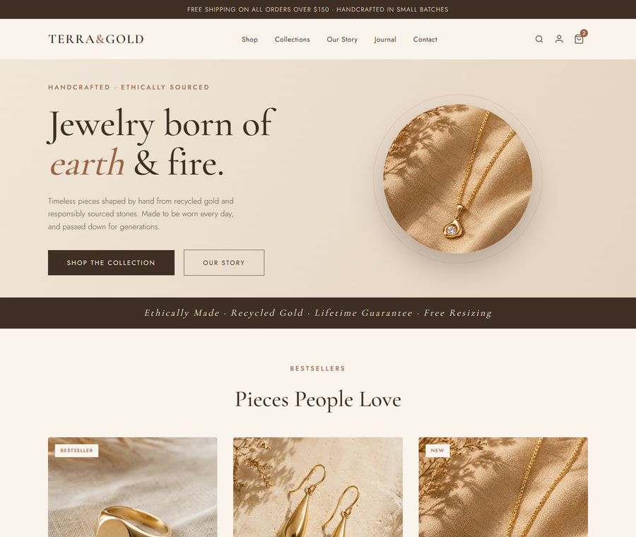
A single-page jewelry store concept designed to test how far a small e-commerce brand can push conversion with clean typography and warm, earthy visuals. Built lean and fast, with a product grid, story section, and email capture in a single scroll.
View Live →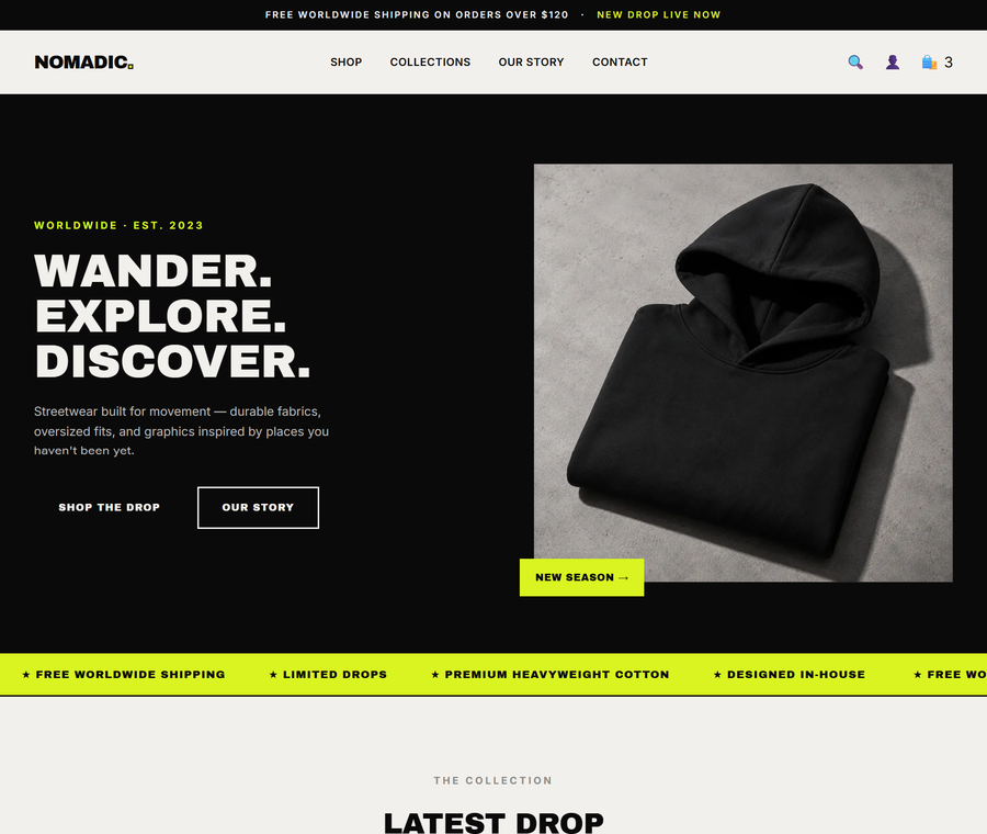
A streetwear brand concept where the design had to feel as bold as the product. We leaned into a black, off-white and acid-yellow palette with a heavier editorial layout — no stock templates, no soft edges. Built to show what a real drop launch could look like.
View Live →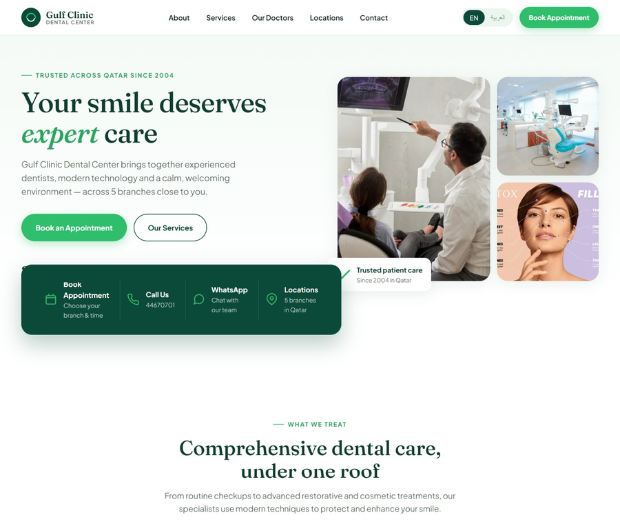
Fully bilingual English + Arabic site for a multi-branch dental group in Qatar. Handled the full RTL layout switch, cultural design considerations, appointment booking flow, and doctor profiles across five branches. Trust-building was the priority — clean spacing, real service depth, no medical clichés.
View Live →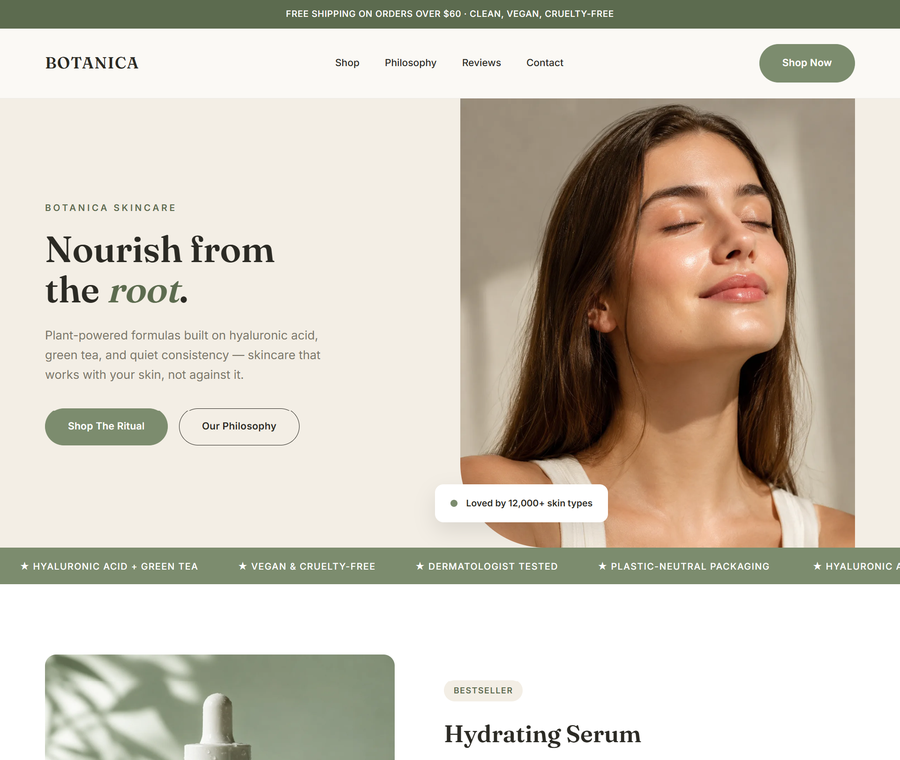
A plant-powered skincare brand concept in a sage-and-beige palette. The challenge was making a small product line look like a full ritual — solved with a featured bestseller section, a "shop the set" banner, and a philosophy story that gives the ingredients real weight.
View Live →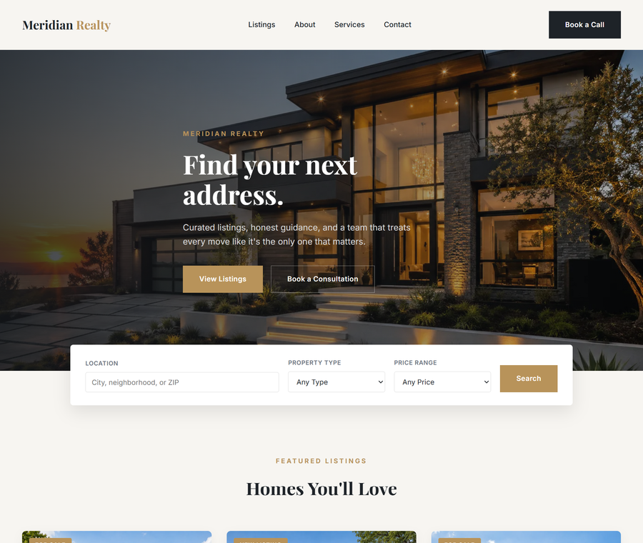
A real estate agency site built around a working search bar, agent bio, and staged listings — the three things a buyer actually needs on the first click. Charcoal and gold palette to feel premium without turning cold. Every section written to answer a buyer or seller's next question.
View Live →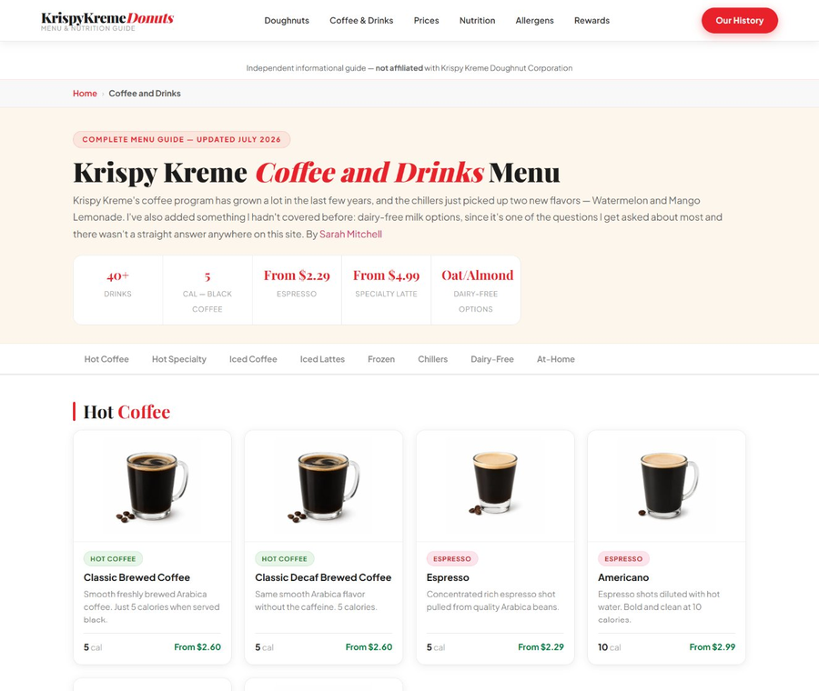
One of our own SEO-driven content sites — an independent menu and nutrition guide covering 40+ drinks with prices, calories and ingredient breakdowns. Built on WordPress with Rank Math, schema markup, and category browsing that ranks for hundreds of long-tail queries.
View Live →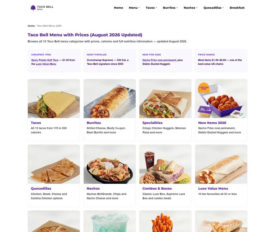
A niche site we built and grew from zero — a fully searchable menu guide covering 14 categories, 100+ items, and complete nutrition data. FAQ schema, internal linking, and mobile-first design pushed CTR high enough to make it a genuinely useful independent guide.
View Live →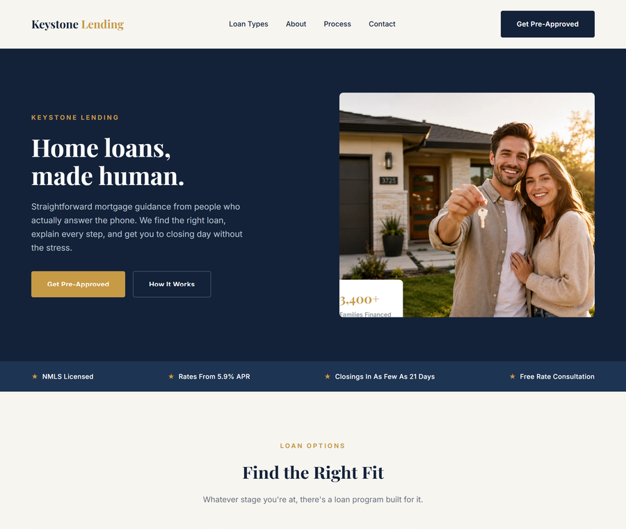
A mortgage broker concept where trust does all the heavy lifting. Navy and gold palette, a clear 4-step loan process, an advisor bio, and a proof-driven hero with real stats — the mortgage niche is competitive, so every section was written to remove hesitation, not add it.
View Live →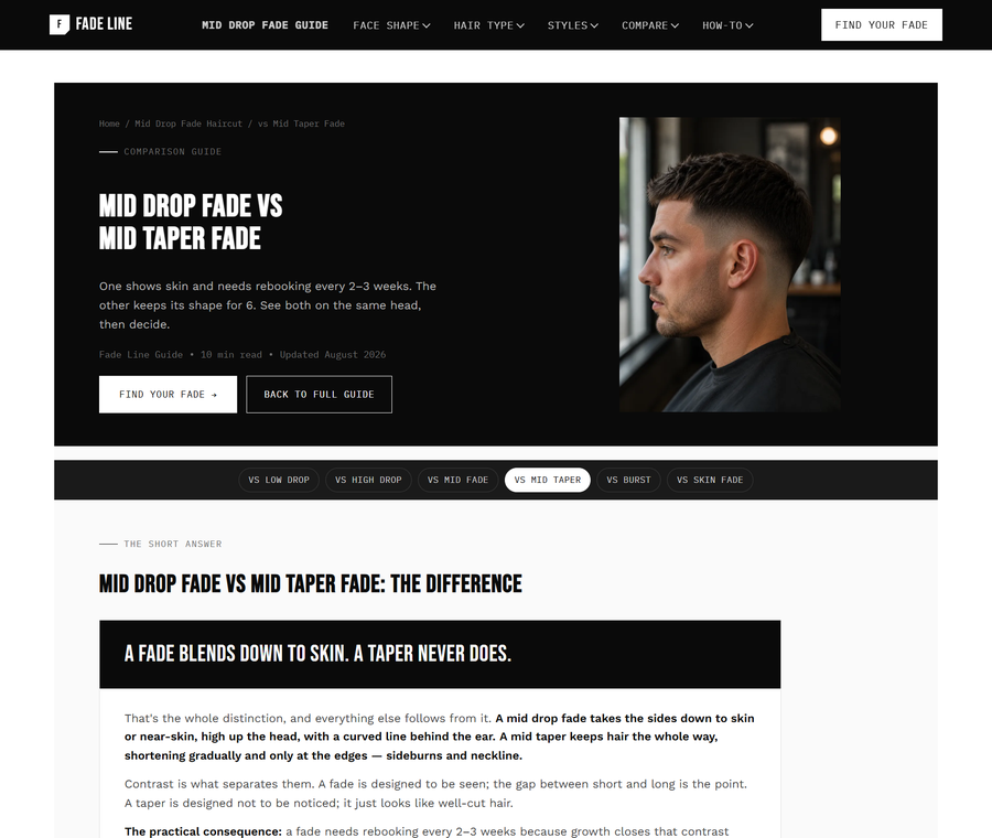
Another of our own content sites — a men's grooming guide focused on the mid drop fade. Written with a real barber's voice, structured around side-by-side style comparisons, and paired with SEO fundamentals that let it out-rank thin competitor pages inside its first quarter.
View Live →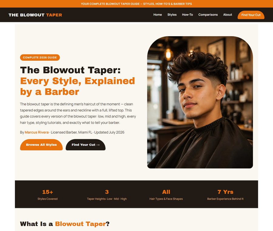
A style-guide site built around a single trending haircut. The strategy was to own the search query with a clean layout, height comparisons, face-shape guidance, and a real practising barber as the author. Depth beats keyword-stuffing, and this site is proof.
View Live →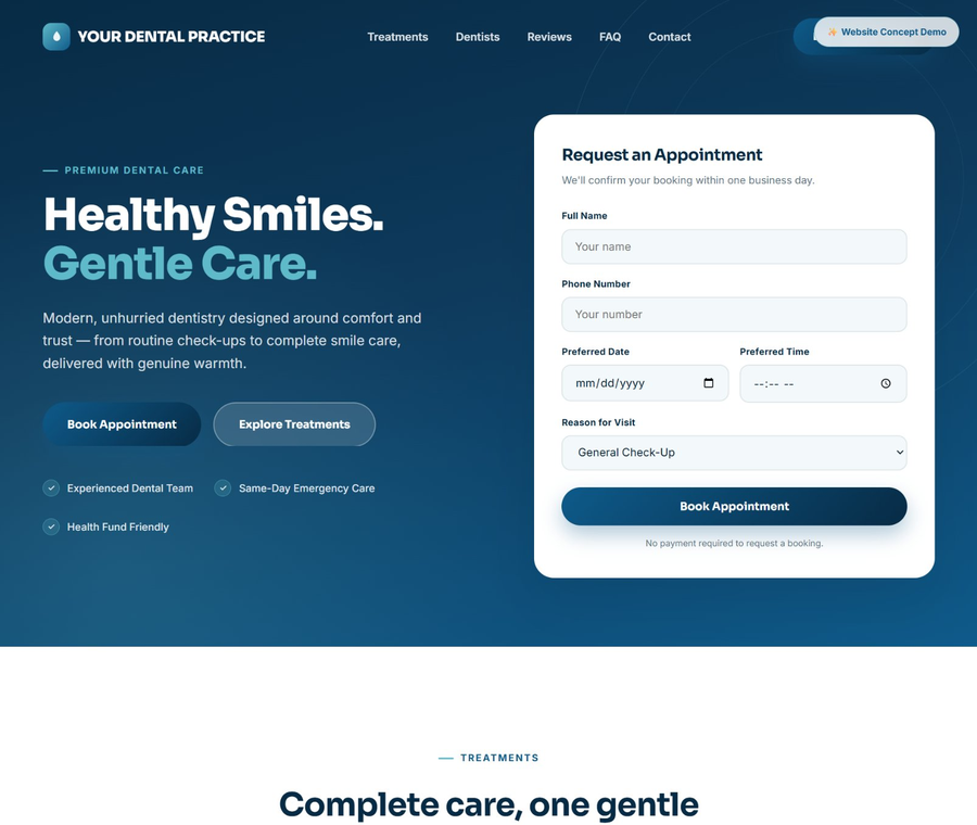
A local dental practice site built around one thing patients actually do first — book an appointment. The form sits inside the hero, not three scrolls down. Clean teal palette, dentist profiles, Google-rating pull, and health-fund badges to answer the questions people already have.
View Live →